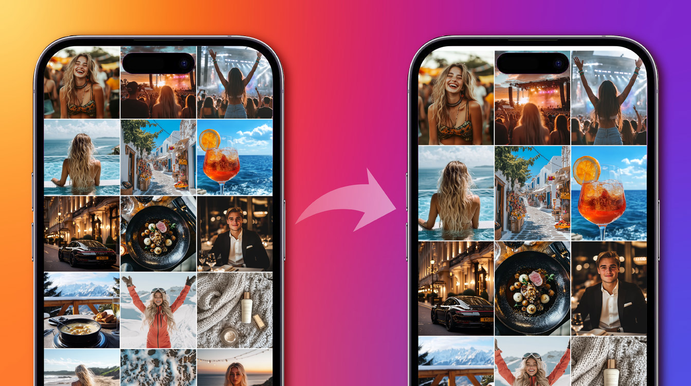
Understanding Instagram's Vertical Grid Transformation
It came as a shock to some, but look closer and Instagram's switch to portrait-oriented grid posts tells us quite a bit about where social media is heading — it shows the big companies are paying attention to how we actually use our phones to create and consume content. While these sorts of changes are always disorientating at first (quite literally in this case), for brands and marketers, understanding the broader implications of this change matters more than the technical specifications or having to adapt to an unfamiliar aspect ratio. Here we explain the reasoning behind the change, how to roll with the punches and why staying flexible andunderstanding what your audience needs and responds to is so vital.
The Data-Driven Decision Behind Instagram's Format Change
The move from Instagram's iconic square format to portrait orientation apparently came from clear user preferences.As Instagram CEO Adam Mosseri explained in a post on the platform, "We started with the tall grid because most photos and videos that are uploaded to Instagram at this point are vertical and rectangles do a better job showing off those photos and videos". It's worth remembering that phones automatically take photos in a vertical format.
We're big fans of data backed decision making, and this was a decision made on real-world usage patterns. There's plenty of stats out there that support this shift:research by Databox shows vertical content achieves 13.8% more visibility on Facebook compared to other formats, while vertical videos specifically see 90% more visibility than image posts. AWibbitz study found vertical videos on Instagram Stories generate 14% higher click-through rates than horizontals. The impact on brand engagement is particularly striking.According to Magna Global, vertical videos achieve a 90% brand recall rate compared to 69% for horizontal videos.HubSpot's research found vertical videos on Instagram Stories achieve 33% higher reach than horizontal formats.
Given all of this, it makes sense to carry the vertical format over to the grid itself — especially as that's the format your phone screen is already in.
Vertical Content Performance Metrics: The Numbers That Matter
- 13.8% higher visibility for vertical content on Facebook
- 90% higher visibility for vertical videos compared to image posts
- 14% higher click-through rates on Instagram Stories with vertical format
- 90% brand recall rate for vertical videos (vs 69% for horizontal)
- 33% higher reach for vertical videos on Instagram Stories
User Reaction and Platform Response to Instagram's Grid Change
The initial reaction to the grid update has been mixed, with plenty of users expressing strong feelings about the change. Content creators and influencers who invested time in crafting carefully designed grid layouts have been particularly vocal about their frustration.As one would-be influencer put it on X: "Whoever had the brilliant idea to change the grid from squares to rectangles? Yeah I hope you get fired." Mosseri acknowledged this disruption, admitting that Instagram hadn't given users enough notice about the change and promising improved thumbnail customisation options to help creators adapt their profiles. "I know some of you spend a lot of time tweaking your grids", he said "and this is going to blow all of that up, so we're going to improve the ability to customize those thumbnails."
Strategic Advantages of Instagram's Vertical Format for Brands
In the plainest terms, vertical posts now fill more of your followers' screens. You've got more space to work with - space that's perfect for step-by-step product demonstrations, detailed infographics, or multi-part stories that would have been squeezed in the old square format.
Instagram's embrace of portrait orientation shows how social media keeps evolving. Users want content that feels natural on their phones. Smart marketing teams are already developing content that fits how their audience actually uses Instagram.
Practical Tips for Managing Your Instagram Grid Transition
Many brands have spent years perfecting their grid aesthetic with carefully arranged product collections, quote tiles that alternate with images, or those satisfying checkerboard patterns. Instagram's new format has disrupted these layouts, but there are several ways to handle the transition:
- Use Instagram's preview adjustment tools to maintain that visual harmony you've worked so hard on. Click the three dots on any post and select "Adjust Preview" to modify how older content appears in your grid. The "Fill" option lets you control which part of your image is prominent.
- Consider archiving particularly mismatched posts temporarily. You can always restore them later once you've established your new grid style.
- For quote tiles and text-heavy content, try breaking your usual template into thirds. Keep your text in the middle section, with balanced spaces above and below. This works in both square and portrait views.
- If you use a specific colour palette or themed rows, gradually transition by starting new rows in the portrait format. This creates a clean break between your old and new styling.
Adapting Your Social Media Strategy for Vertical Content
Study how your audience engages with different post formats. Test new approaches. Track what works. Keep what resonates with your community.
We're seeing brands succeed when they experiment with the vertical format's storytelling possibilities while staying authentic to their voice.
Understanding how your audience responds to platform changes can be complex. Our team specialises in analysing social media engagement patterns and user behaviour to help brands make informed strategic decisions.Get in touch to learn how we can help you navigate the evolving social landscape.
FAQ About Instagram's Vertical Grid Update
Why did Instagram change to a vertical grid format?
Instagram made this change based on user behavior data showing most photos and videos uploaded to the platform are already vertical, reflecting how people naturally use their smartphones.
How will the vertical grid affect my brand's Instagram performance?
Data suggests vertical content performs better, with higher visibility, engagement, and brand recall rates compared to square or horizontal formats.
Can I adjust how my old square posts appear in the new vertical grid?
Yes, Instagram offers preview adjustment tools. Simply click the three dots on any post and select "Adjust Preview" to modify how older content displays.
What content types work best in Instagram's vertical format?
The vertical format excels for step-by-step tutorials, product demonstrations, before/after comparisons, infographics, and storytelling content that benefits from the additional vertical space.
How can I maintain a cohesive aesthetic with both old and new posts?
Consider using consistent color schemes, gradually transitioning row by row, or using Instagram's preview adjustment tools to create visual continuity between your square and vertical content.
Patrick Charlton Published on February 20, 2025 1:00 pm
Frequently Asked QuestionsFAQs
Why did Instagram switch from square to vertical grid posts?
Instagram made this change because most photos and videos uploaded to the platform are already vertical, matching how people naturally use their smartphones. The decision was based on user behavior data showing this format better displays the content people are actually sharing.
Does vertical content perform better than square posts on Instagram?
Yes, research shows vertical content significantly outperforms other formats. Vertical videos achieve 90% higher visibility than image posts and generate 14% higher click-through rates on Instagram Stories compared to horizontal content.
Can I fix how my old square Instagram posts look in the new vertical grid?
Yes, Instagram provides preview adjustment tools to help with this transition. You can click the three dots on any post, select 'Adjust Preview,' and use the 'Fill' option to control which part of your image is most prominent in the new format.
What type of content works best with Instagram's vertical grid format?
Vertical format is ideal for step-by-step tutorials, product demonstrations, detailed infographics, and multi-part stories. The additional vertical space allows for more comprehensive content that would have been cramped in the old square format.