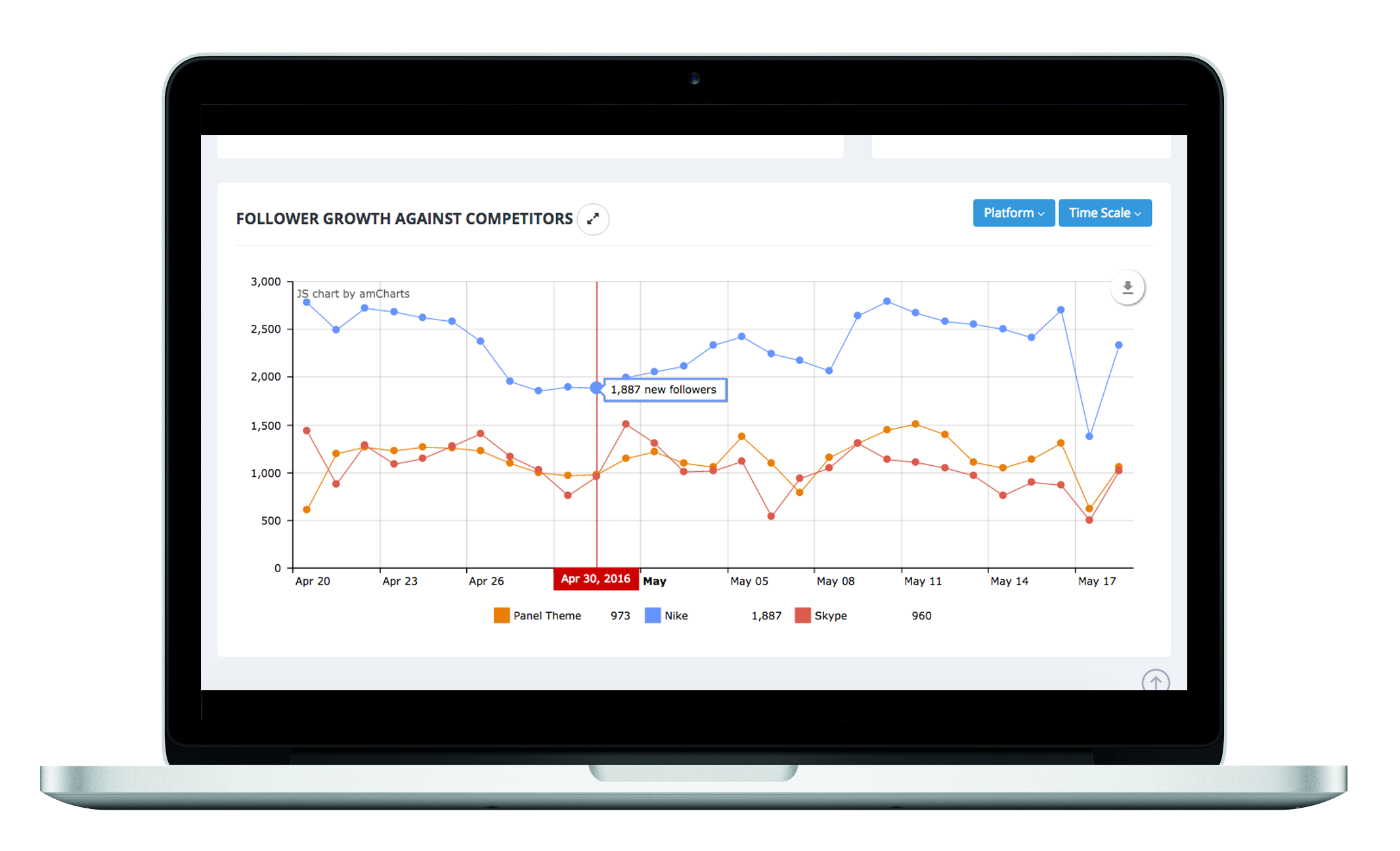
 We’ve invested greatly in navigation improvement to make things easier to find, access and amend. Starting with our “Data Settings” tab, you can jump directly to individual settings pages via an expansion menu from any page in our Insights Platform. This focus extends to our Dashboard Builder too. You’ll now see two Visualisation Dashboard previews across the screen (or one for mobile devices), with the action buttons along the bottom. The ‘Launch’ button now opens the dashboard straight into HTML5 ready for any device -- mobile, desktop or tablet.
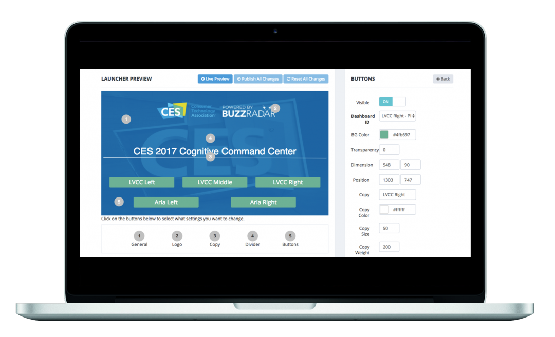
  Have numerous Dashboards? One of our biggest new features is just for you then: Dashboard Launcher. The Dashboard Launcher enables you to collate a number of Dashboards into one quick-access one-click screen. This is available within our new Chrome App, or simply an in-browser link. You can build several different Launcher screens, great for distributing different sets of dashboards to different people in your value chain. It’ll ensure the right people are connecting with the right data, and all controlled from the cloud. These are just a few of over 250 separate improvements we’ve made across our products. So, the question is; What are you waiting for? Take a free trial and let us know what you think, we’re always looking for feedback!
Nicky Yates Published on February 14, 2017 9:57 am
Frequently Asked QuestionsFAQs
What is Buzz Radar's Insights Platform?
Buzz Radar's Insights Platform is a social intelligence tool that helps organizations collect, analyze, and visualize data for decision-making. The platform includes features like interactive charts, dashboard builders, and data export capabilities designed to speed up the insights process.
What new features does the updated Buzz Radar platform include?
The updated platform includes over 250 improvements such as more intuitive chart interfaces, in-screen annotation capabilities, improved navigation with direct access to settings, and a Dashboard Launcher feature. Users can now export data in more formats and access dashboards optimized for mobile, desktop, and tablet devices.
What is Dashboard Launcher in Buzz Radar?
Dashboard Launcher is a feature that allows users to combine multiple dashboards into one quick-access screen with one-click navigation. It's available as a Chrome App or browser link and helps distribute different dashboard sets to different team members efficiently.
Can I try Buzz Radar's platform for free?
Yes, Buzz Radar offers a free trial of their Insights Platform. This allows potential users to test the new features and improvements before committing to a paid plan.


